We knew our Provider Search tool was full of issues, but it was difficult in knowing where to start. Our goal was to simplify the experience, to focus on getting a provider match for our members, so we had to backwards from that by identifying ways we could make easy, big wins and iteratively optimize from there.
Frameworks & Deliverables
We already had a ton of research and data collected, organized and ready. toshare out with our product and stakeholder teams to kick off the initiative:
- Qualitative Data: We began by categorizing 2k shared user feedback entries to categorize themes and prioritize the most common issues.
- Web Analytics: We reviewed our analytics data to understand utilization of the tool, and how search results were peforming based on different use inputs.
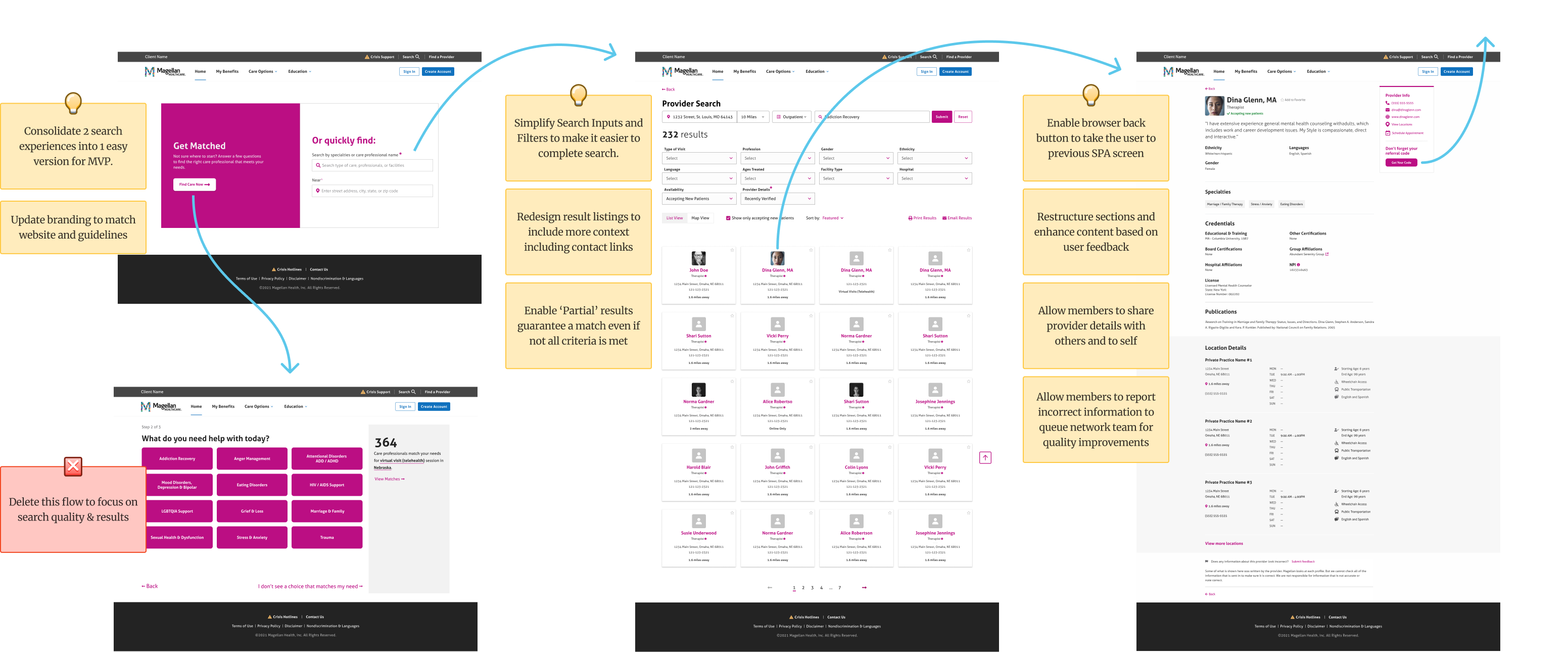
- White Board Session: We mapped out the end to end flow in Figma and added stickies where the issues were happening throughout the experience.
- Live Persona Demo: We went through the live experience as our persona's would and experienced the issues first hand to empathisize and discuss the issue.
Key Discovery Insight
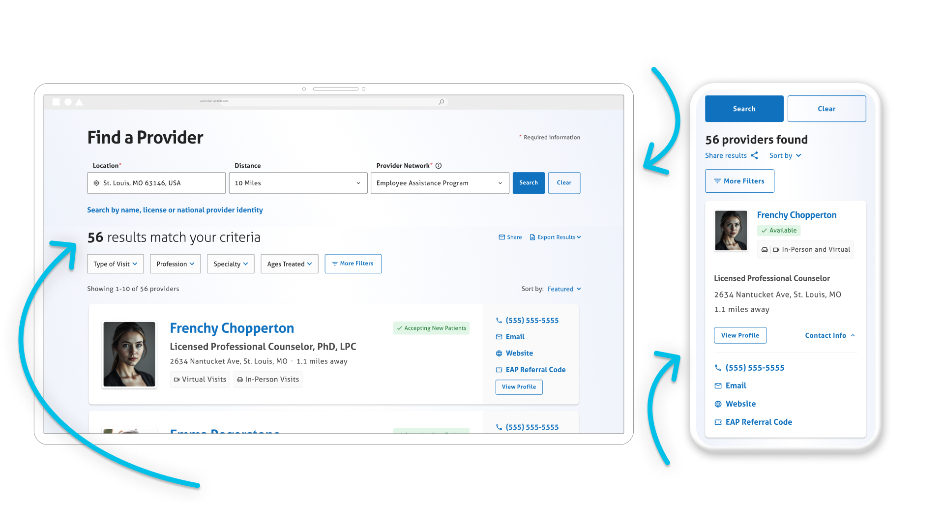
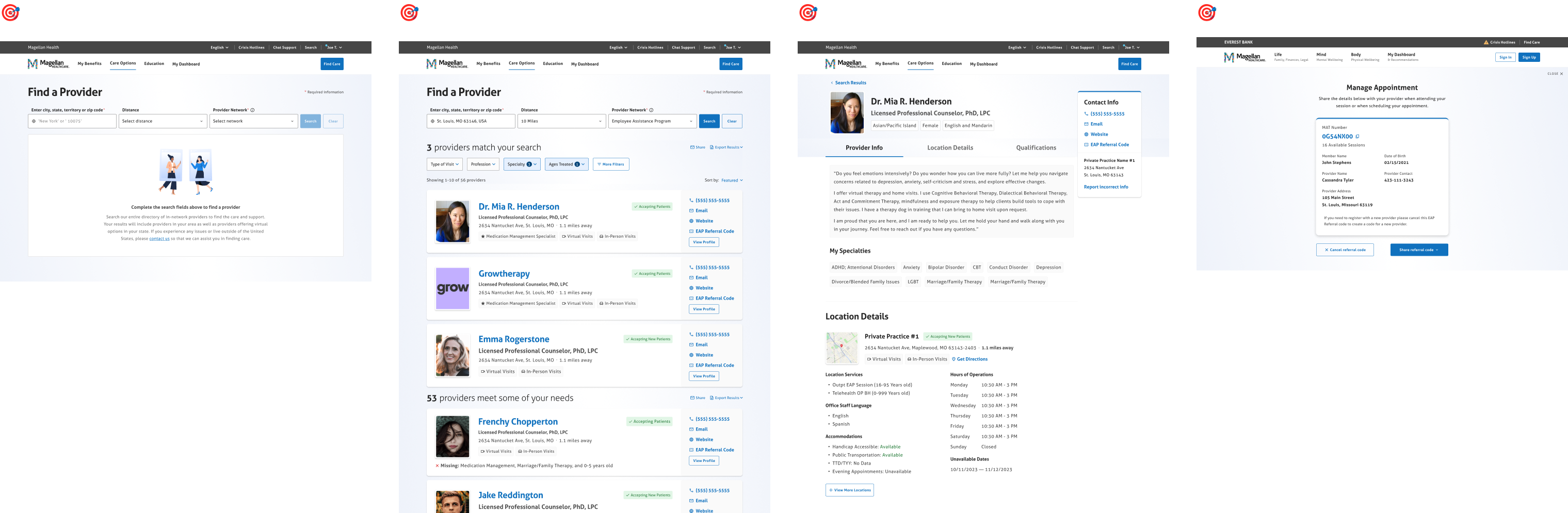
We found that best way to improve the experience was to remove the 'get matched' multi-step survey search option and focus on our quick search path until we improved our search logic, results algorithm, and overall look and feel to be consistent with the portal it was embedded on. From there, we could iteratively enhance the experience once the experience was more stable and usable.
Cross-Functional Collaboration
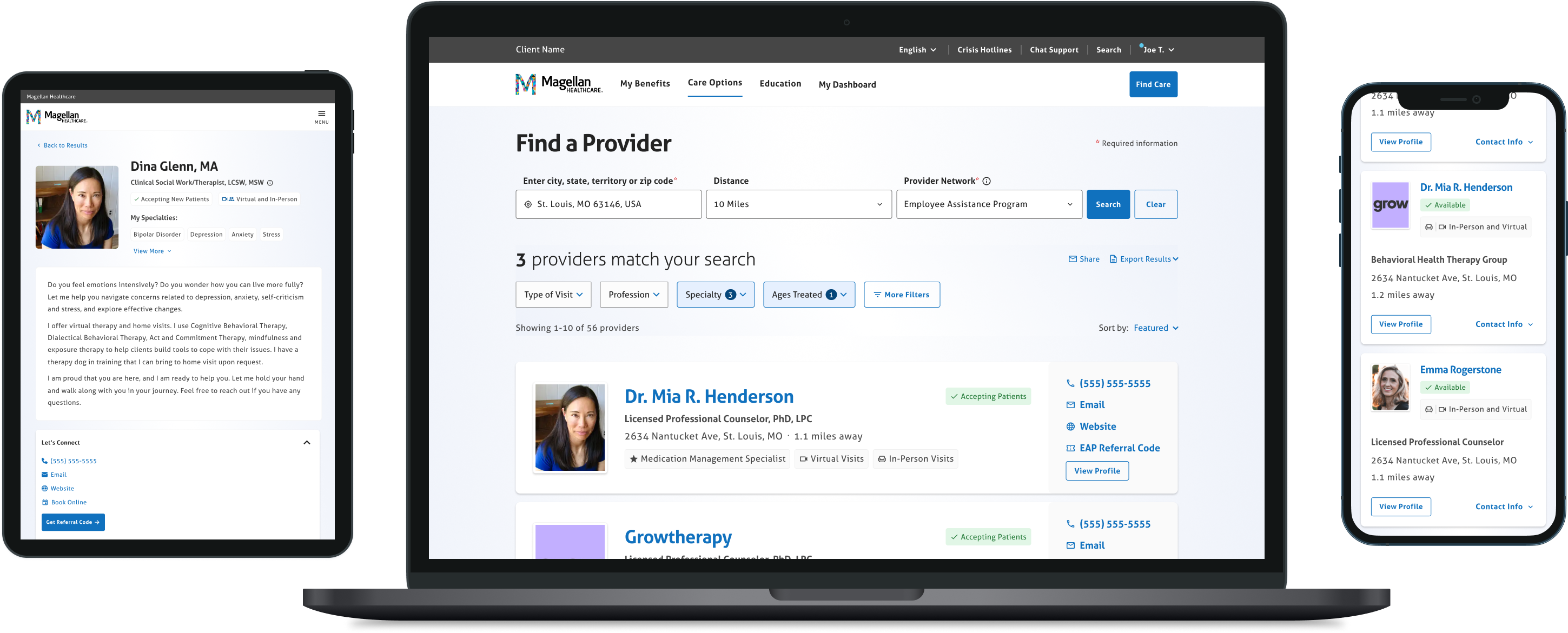
We created a prototype based on what we thought the new V1, simplified version of Provider Search would look like to present to our stakeholders and development teams for feedback. They were thrilled to see us investing in this area and agreed completely with our approach, leading us to feeling very confident going forward.