
This case study generalizes data and internal details. Metrics are approximate and provided for illustrative purposes only.
Role
UX Design Manager
Team
Product Managers, UX Design Team, and Multiple Development and Scrum Teams
Timeline
2 Months
Tools
Figma, LifeRay DXP, GitHub, StoryBook, GitHub Pilot, and VS Code
Project Type
Design and Development Optimization
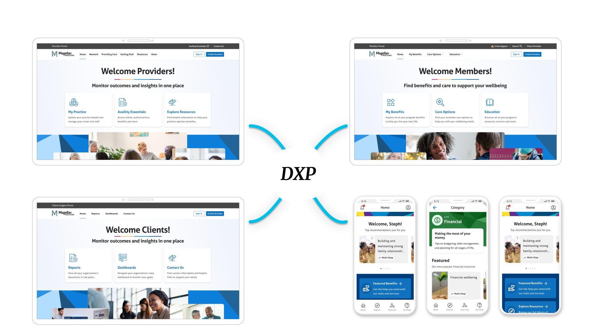
Our product organization had established 4 dedicated product teams including product managers, designers, developers, and scrum teams. Our Member portal team had recently established a UI Kit made up of Figma styles, components and patterns, but it was not connected to our code base in anyway. Soon after, our other teams needed to begin building similar interfaces, and it was difficult to hand over Figma designs without a lot of hand holding and walkthroughs.
The Business Problem
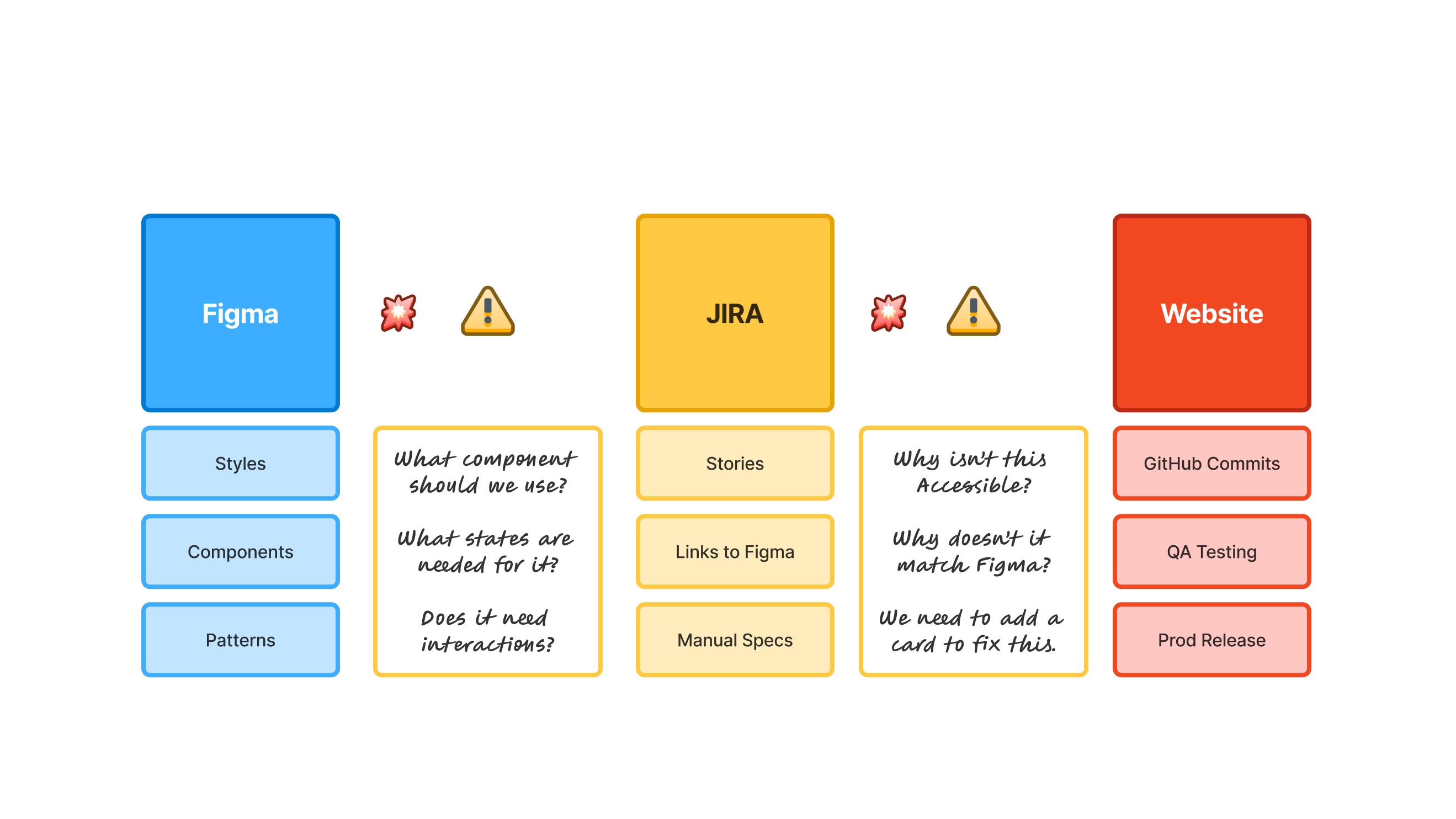
We needed to build consistent digital experiences across our products that met our brand guidelines, accessibility requirements, and best practices. We had 9 development teams, and we didn't have a dedicated role to maintain our design system. All teams were spread thin with contractual deliverables, and no efforts could be made to establish a holistic design system based in code that developers could easily use without jeopardizing existing commitments.
The User Pain
Our member portal users found our experiences consistent, but as our new products took off, developers started implementing interfaces that were confusing, using extra CSS styling and configurations that were not needed, and introducing issues we had already confronted with our member team. We needed to establish our styles, components, and patterns in a formal way in order to streamline development efforts to deliver experiences our members epxected, and in a way that was easy to use and intuitive across screens.
Project Goals
This initiative wasn't funded, or sought after from the business. It was a passion project started by my team in order to make developer efforts more efficient, straightforward, and enjoyable to be a part of. Our goal was to ensure our teams used the same UI components in terms of look and feel, functionality, and met our accessibility guidelines.

In order to implement a design system that worked for multiple teams, we first needed to understand what success would mean from our developers. We needed to understand how our Figma components are translated into code components. We also had to learn how Figma organized, structured, and created connections across teams, projects and files. It was through this learning, that we defined the primary deliverables that would be needed.
Frameworks & Deliverables
Through our discovery, we identified the following 3 artifacts we would need to have in place to make our vision a reality.
Key Discovery Insight
While the steps to success were clear, we realized that we were lacking knowledge on the development side. We knew how HTML and CSSS worked, but we weren't sure how to systematically build out code components with variations that could be fed to multiple product teams in a way that could be maintained without creating negative downstream impacts.
Cross-Functional Collaboration
We setup a series of meetings with our lead developers, designers, accessibility specialists, scrum teams, and QA teams to better understand their process along with other helpful insights to their role-specific needs. By doing this, we were able to remove efforts that we assumed would be helpful, but actually wouldn't be. We also learned about how code works, and what additional features would be needed to make this work hollistically for everyone.

By collaborating with our dev team, were able to identify the best ways that supported our design and user experience needs, balanced with the needs of our developers that would lead to a long-lasting system that would require minimal effort to maintain overtime due to our limited developer resources at the time.
The Core Design
After collaborating with our dev team, we identified the best way to establish our system by cloning a copy of an existing design system that our digital experience platform leveraged. This way, everything we did would be as 'out of the box' as possible and could be maintained overtime without relying on our dev team. From there, we could make slight customizations and introduce new elements that woudn't conflict with upstream updates overtime.
Key Artifacts
A single Figma design file was created that included all of the base components from our cloned system, and organized in a way that made most sense for our team and use. We also customized the styling using tokens for control over white labled expereinces, and included documentation for designers to help guide the usage of each component and pattern. Finally, we were able to link components to GitHub to make it easy for developers when translating our designs into their code,
Measurable Improvement
After introducing the new system, we found our Dev teams were fully in-sync with what components should be used, but we still had some issues. For example, many of our components in our live environment had custom CSS already implemented which created tech debt. On top of that, our base system components weren't full accessible so we would still need to enhance them overtime to meet our standards.

Overall our new design system was a huge success with our development teams. We had less back and forth in scrum ceremonies, developers were empowered to choose the correct components to bring into their work, and our releases had 3x less defects reported after implementations.
Adoptions: All 3 product teams were able to use the same design system and we even created a process in place to have product-specific components for those without causing confusion across teams for maximum usability.
Velocity: Each sprint had a 20% reduction in estimated effort and our scrum ceremonies no longer ran over, or needed additional meetings to refine cards and support developers in choosing the right components.
Scaleable: Our system is based in Boostrap and Clay UI which enabled us to rely on these system to maintain themselves overtime even with our new additions and customizations which helped the organization gain confidence in it for the long run.
This work was very collaborative, fun, and a great learning experience for everyone involved. However, I couldn't help but notice other organizations having more mature systems, backed with Storybook and even AI integrations. Unfortunately, these improvements would require more developer time that our priorities don't support at this time.